Journal / Journal
White, Tactile, and Built for Kids Who Need More Help — Not Less Noise
E-ink, high-contrast white faces, and physical dials aren't aesthetic flourishes. For neurodivergent kids and kids who are hard of sight, they're the difference between a usable phone and another glowing trap — and why the anti-screen movement must design for additional assistance, not around it.
Thomas O'Connell · July 12, 2026
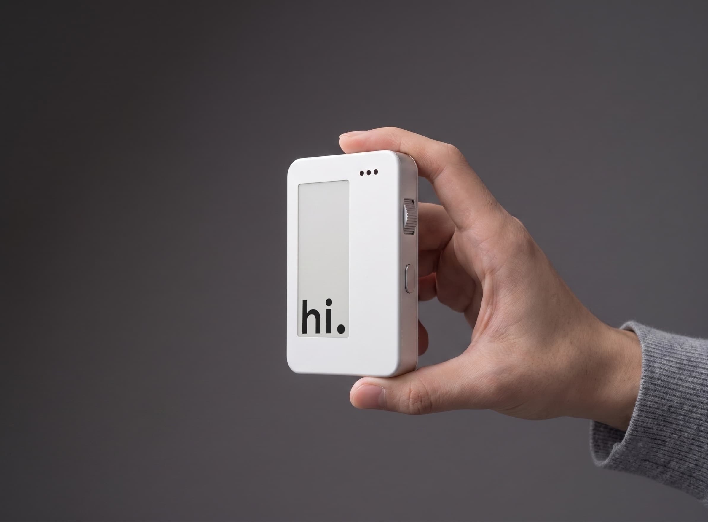
Most "kids' phones" start from the same wrong assumption: that every child benefits from a bright glass rectangle, as long as you slap parental controls on top. That ignores an entire population of kids for whom the screen itself is the problem — not just the apps.
Neurodivergent kids. Kids who are hard of sight. Kids with sensory processing differences who melt under notification light and infinite scroll. The anti-screen movement isn't only about "less Instagram." At its best, it is about designing connection for people who need additional assistance — not designing around them.
Why white and tactile matter
A white, matte face with a high-contrast e-ink strip is easier to read in hard light than a glossy OLED. Paper-like displays don't pulse, don't glow in a dark bedroom, and don't compete with the room for attention. For kids with low vision or light sensitivity, that difference is practical — not philosophical.
Tactile controls — a knurled scroll dial, a physical call bar you can find by feel — are accessibility features. Eyes on the sidewalk. Eyes closed. Hands in a pocket. Motor planning that prefers click-detents over precise glass gestures. White space and raised controls aren't "retro styling." They are a map your fingers can learn.
Neurodivergence and the attention casino
For many ADHD and autistic kids, a smartphone is not a neutral tool. It is a casino floor: variable rewards, endless novelty, social pressure that never clocks out. Parental controls can mute an app. They cannot remove the architecture that was built to hijack attention.
Voice-only hardware with a closed contact list removes the casino. What's left is the thing those kids often need most: a predictable way to reach the people they trust, without a feed waiting in the same device.
Hard of sight is not an edge case
If your child is hard of sight — low vision, contrast sensitivity, photophobia — a modern phone UI is a maze of tiny type, animated chrome, and autoplaying video. An e-ink contact strip with large, stable text and a dial you can operate without staring is closer to how assistive tools actually work: fewer pixels, more certainty.
We are not claiming Loup replaces clinical assistive technology. We are saying the default first phone should not make life harder for kids who already navigate extra friction every day.
What the anti-screen movement owes them
Anti-screen advocacy that only talks about "willpower" and "screen time limits" leaves neurodivergent and low-vision kids behind. Limits assume a device that is basically fine if you use it less. Accessibility assumes a device that is usable when you need it — and quiet when you don't.
That is why we built white, tactile, voice-first hardware. Connection for kids who need additional assistance should not require surviving another glowing rectangle. It should feel like a phone you can hold, find, and trust — with your eyes, or without them.